Custom Search
Howdy, Stranger!
It looks like you're new here. If you want to get involved, click one of these buttons!
Categories
- 3.4K All Categories
- 35 Nikon Z lenses
- 82 Nikon Z cameras
- 1.4K Nikon DSLR cameras
- 11 Df
- 237 D6x0/D7x0/D8x0
- 27 D300/D300s/D500
- 29 D3x00
- 45 D3/D4/D5
- 31 D5x00
- 95 D90/D7x00
- 388 Nikon Lenses
- 9 Videos, Nikon et. al.
- 52 Nikon 1
- 18 Nikon Film Cameras
- 56 Nikon Flashes
- 25 Nikon Compact Cameras
- 49 Nikon Software
- 26 Nikon Deals
- 768 General Discussions
- 49 Gear Reviews
- 182 Other Manufacturers
- 105 Fun & Weird
- 128 Photo-a-day
In this Discussion
Who's Online (1)
- mhedges 6:12PM
MTF Chart Interpretation
 Msmoto
Posts: 5,398Moderator
Modulation Transfer Function.....yikes, how confusing. So, I have produced a couple of images which could be helpful in the clearing up the confusion of exactly what these mean. My understanding, the charts measure the resolution and contrast by looking at thin (30 lines per mm) and thick (10 lines per mm) in orientations which are lined up with a radius from the center of the lens outward (sagittal) and lines which are tangential to a circle of coverage, i.e, at 90° to the sagittal lines (meridional).
The measurements are taken at varying distances from the center of the image, and distance from the center vs. resolution of the images on the chart used. The higher the resolution, the higher on the vertical axis the point shows up. This is highly simplified as the mathematics are complex.
In general, the thick (10 lines/mm) are a measurement of contrast and the thin (30 lines/mm) are more a measure of sharpness.
One caveat is to avoid comparing MTF charts for lenses which vary widely in focal length as this has no meaning. The usefulness is looking at perhaps wide angle lenses or telephoto, but not to attempt to compare the two.
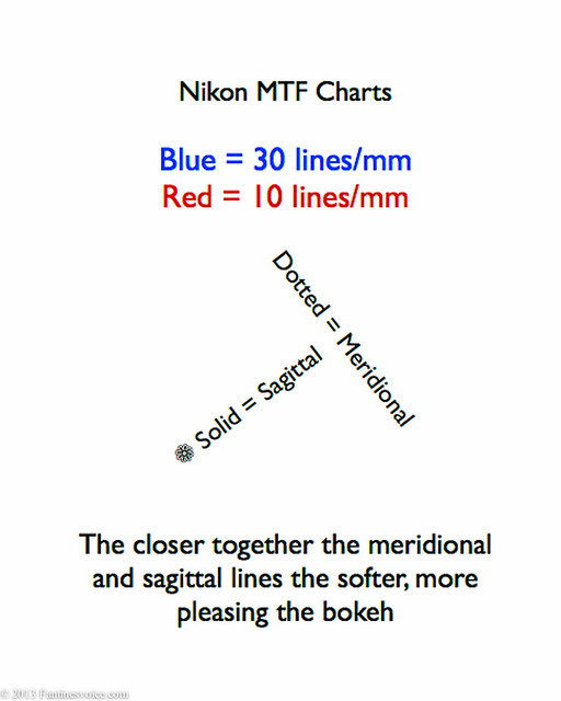
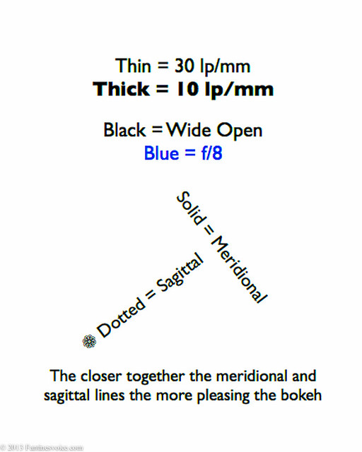
How do we remember all this. Unfortunately MTF charts vary in how they show the data. Here are two examples which I have drawn, hopefully to help anyone who has an interest in this.

A different style MTF Chart:

Please...if there are errors or omissions in this post, help me out and correct me.
Here is an MTF chart from Nikon to see as an example:

The measurements are taken at varying distances from the center of the image, and distance from the center vs. resolution of the images on the chart used. The higher the resolution, the higher on the vertical axis the point shows up. This is highly simplified as the mathematics are complex.
In general, the thick (10 lines/mm) are a measurement of contrast and the thin (30 lines/mm) are more a measure of sharpness.
One caveat is to avoid comparing MTF charts for lenses which vary widely in focal length as this has no meaning. The usefulness is looking at perhaps wide angle lenses or telephoto, but not to attempt to compare the two.
How do we remember all this. Unfortunately MTF charts vary in how they show the data. Here are two examples which I have drawn, hopefully to help anyone who has an interest in this.

A different style MTF Chart:

Please...if there are errors or omissions in this post, help me out and correct me.
Here is an MTF chart from Nikon to see as an example:

Post edited by Msmoto on
Msmoto, mod
Disclaimer: This site has no affiliation with Nikon Corporation or any of its subsidiary.
Disclosure: [NR] is sponsored by displaying advertising banners and links.
All trademarks and brands belong to their respective owners.
Want to advertise on NikonRumors.com? Contact [NR].
Copyright © 2008-2017 NikonRumors.com.
See our Privacy Policy.
Disclosure: [NR] is sponsored by displaying advertising banners and links.
All trademarks and brands belong to their respective owners.
Want to advertise on NikonRumors.com? Contact [NR].
Copyright © 2008-2017 NikonRumors.com.
See our Privacy Policy.

Comments
The MTF chart tells us how much contrast is lost (or retained) as we go from the center of the lens to the edge of the lens. In the above example, the contrast is measured at two different frequencies (red line vs. blue line), and along the diagonal of the frame vs. perpendicular to it (solid vs. dotted lines).
Aside from contrast, the higher frequency measurement (30 lines/mm) gives us some notion about the lens's ability to resolve small details (resolution).
In general the higher and straighter the MTF lines, the better the lens is.
Caveat: one cannot compare measurements from one manufacturer vs. another's. E.g., Nikon MTF charts are based on actual measurements while Canon MTF charts are based on theoretical calculations. There are pros & cons to both approaches.
Thanks, good points, especially the comparison issue. As noted in the two charts, one uses dotted for the meridional and the other uses dotted for the sagittal lines on the target.
Me wanty.
D3 • D750 • 14-24mm f2.8 • 35mm f1.4A • PC-E 45mm f2.8 • 50mm f1.8G • AF-D 85mm f1.4 • ZF.2 100mm f2 • 200mm f2 VR2
This is simply amazing...
Start saving!
D3 • D750 • 14-24mm f2.8 • 35mm f1.4A • PC-E 45mm f2.8 • 50mm f1.8G • AF-D 85mm f1.4 • ZF.2 100mm f2 • 200mm f2 VR2