
Custom Search
Howdy, Stranger!
It looks like you're new here. If you want to get involved, click one of these buttons!
Categories
- 3.4K All Categories
- 35 Nikon Z lenses
- 83 Nikon Z cameras
- 1.4K Nikon DSLR cameras
- 11 Df
- 237 D6x0/D7x0/D8x0
- 27 D300/D300s/D500
- 29 D3x00
- 45 D3/D4/D5
- 31 D5x00
- 95 D90/D7x00
- 388 Nikon Lenses
- 9 Videos, Nikon et. al.
- 52 Nikon 1
- 18 Nikon Film Cameras
- 56 Nikon Flashes
- 25 Nikon Compact Cameras
- 49 Nikon Software
- 26 Nikon Deals
- 768 General Discussions
- 49 Gear Reviews
- 182 Other Manufacturers
- 105 Fun & Weird
- 128 Photo-a-day
In this Discussion
Who's Online (0)
Crop for Modern Art?
Here is something to try. Take an image with good colorful out of focus sections. Enlarge the image to 100%. Crop segments out to emulate modern art painting: just pleasing patterns and colors. See what you can get. Here are some I did. They are best viewed on Flicker in the lighbox with the black surround.
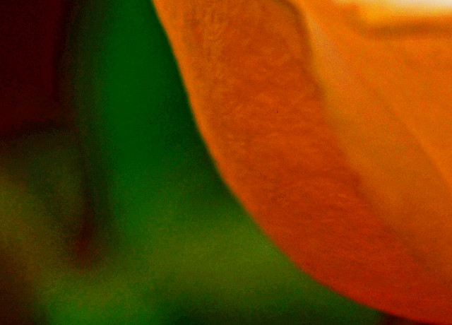
Viewed in lightbox: http://www.flickr.com/photos/76080384@N03/8484380104/in/photostream/lightbox/
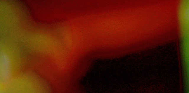
Viewed in lightbox: http://www.flickr.com/photos/76080384@N03/8484380082/in/photostream/lightbox/

Viewed in lightbox: http://www.flickr.com/photos/76080384@N03/8484424582/in/photostream/lightbox/
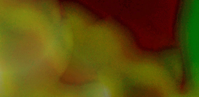
Viewed in lightbox: http://www.flickr.com/photos/76080384@N03/8483286707/in/photostream/lightbox/

Viewed in lightbox: http://www.flickr.com/photos/76080384@N03/8484379944/in/photostream/lightbox/

Viewed in lightbox: http://www.flickr.com/photos/76080384@N03/8483286577/in/photostream/lightbox/
The above "modern art" crops all came from this photo. Can you find them?

I like the second one best when viewed in lightbox.
Try this technique and post your results in this thread. It is surprising what pleasing colors and shapes we can find "hidden" in our photos.

Viewed in lightbox: http://www.flickr.com/photos/76080384@N03/8484380104/in/photostream/lightbox/

Viewed in lightbox: http://www.flickr.com/photos/76080384@N03/8484380082/in/photostream/lightbox/

Viewed in lightbox: http://www.flickr.com/photos/76080384@N03/8484424582/in/photostream/lightbox/

Viewed in lightbox: http://www.flickr.com/photos/76080384@N03/8483286707/in/photostream/lightbox/

Viewed in lightbox: http://www.flickr.com/photos/76080384@N03/8484379944/in/photostream/lightbox/

Viewed in lightbox: http://www.flickr.com/photos/76080384@N03/8483286577/in/photostream/lightbox/
The above "modern art" crops all came from this photo. Can you find them?

I like the second one best when viewed in lightbox.
Try this technique and post your results in this thread. It is surprising what pleasing colors and shapes we can find "hidden" in our photos.
Post edited by donaldejose on
Disclaimer: This site has no affiliation with Nikon Corporation or any of its subsidiary.
Disclosure: [NR] is sponsored by displaying advertising banners and links.
All trademarks and brands belong to their respective owners.
Want to advertise on NikonRumors.com? Contact [NR].
Copyright © 2008-2017 NikonRumors.com.
See our Privacy Policy.
Disclosure: [NR] is sponsored by displaying advertising banners and links.
All trademarks and brands belong to their respective owners.
Want to advertise on NikonRumors.com? Contact [NR].
Copyright © 2008-2017 NikonRumors.com.
See our Privacy Policy.

Comments
Click the image and examine on Flickr at a larger size. The :"banding" may disappear.
Now some people will argue this technique is neither art nor photography because it is not intentional and it is not in focus. You are just finding random sections of out of focus areas in the background of a photo. True. But you are intentionally looking for something pleasing to you in the randomness and you are intentionally selecting a frame to crop out just what you want to show. And, of course, you are post processing to enhance whatever effect you desire. Is that not what much of photography does? We don't create nature or street scenes. We observe randomness, find something interesting in it, crop to the composition we wish to capture and then we post process to enhance whatever effect we desire. Not so much difference.
Give me a beautiful landscape, cityscape or wildlife image any day.
+1 definitely!
Look at this image in the black lightbox surround: http://www.flickr.com/photos/76080384@N03/8484380082/in/photostream/lightbox/
It gives me a "warm glow." I see beauty there and wouldn't mind having it on my wall. But that same image doesn't generate the same feelings in me when viewed in PAD or when viewed on flicker with a white surround in any size. To me it is the black surround which completes the image. I guess this one should be framed and matted in black to produce the emotions I can feel from it.
Does it make any difference to your feelings if you view these images on PAD or in the lighbox with the black surround?
Gab: your image is more impressionist than modern art. I like it better than mine. What technique did you use?
These two images are excerpts run through two different Elements 11 fllters.
The Palette Knife Filter.
The Ocean Ripple Filter.
I think it works better if we crop closer:
Palette Knife Filter Excerpt from photo above.
Ocean Ripple Filter Excerpt from photo above.
I still think Gab's is the most artistic so far.
Might not even have to crop them.
You overlooked the word 'most' PB. 8-|
@dissent - LOL!
BUT a word about beauty and I will use the human face as an example. Anyone who has used Portrait Professional will realize the program is making slight changes to facial features, not just removing pimples. Anyone who has studied the results of plastic surgery or has simply observed the faces of "stars" improving over time will realize there must be some unconsciously accepted facial shapes and ratios between facial features that are found to be more pleasing to most humans. I have seen plastic surgeons discuss what these ratios are and how to make small adjustments to the human fact to achieve them. This is what many "stars" are doing. They don't look different, they just look much better. Now the current scientific hypothesis is that humans have been "hard wired" by hundreds of thousands or millions of years of experience to select mates based upon some visible features which are linked to more reproductive success and healthier children. In short, survival of the fittest tends to define the fittest as the most beautiful. Beauty becomes a proxy for selecting the fittest to enhance chances of survival of our genes. It is an interesting hypothesis which suggests "beauty" is not entirely subjective. If that is true, I wonder if it applies beyond the human face and body? Do we like images of animals because they are food? Do we tend to like the warm colors because they remind us of a fire and we want to be warm rather than cold? Are we drawn to babies because they represent survival of our genes? There just may be some objective basis for our various tastes as to what is beautiful.
D5100, 18-55 kit lens.
It is an oak leaf trapped in long grass I noticed this morning as I wondered around an office complex waiting for my wife to finish her appointment.
Being a photographer is a lot like being a Christian: Some people look at you funny but do not see the amazing beauty all around them - heartyfisher.
Here is the image before using the Elements 11 Ocean Ripple filter.